OSWALD FAMILY
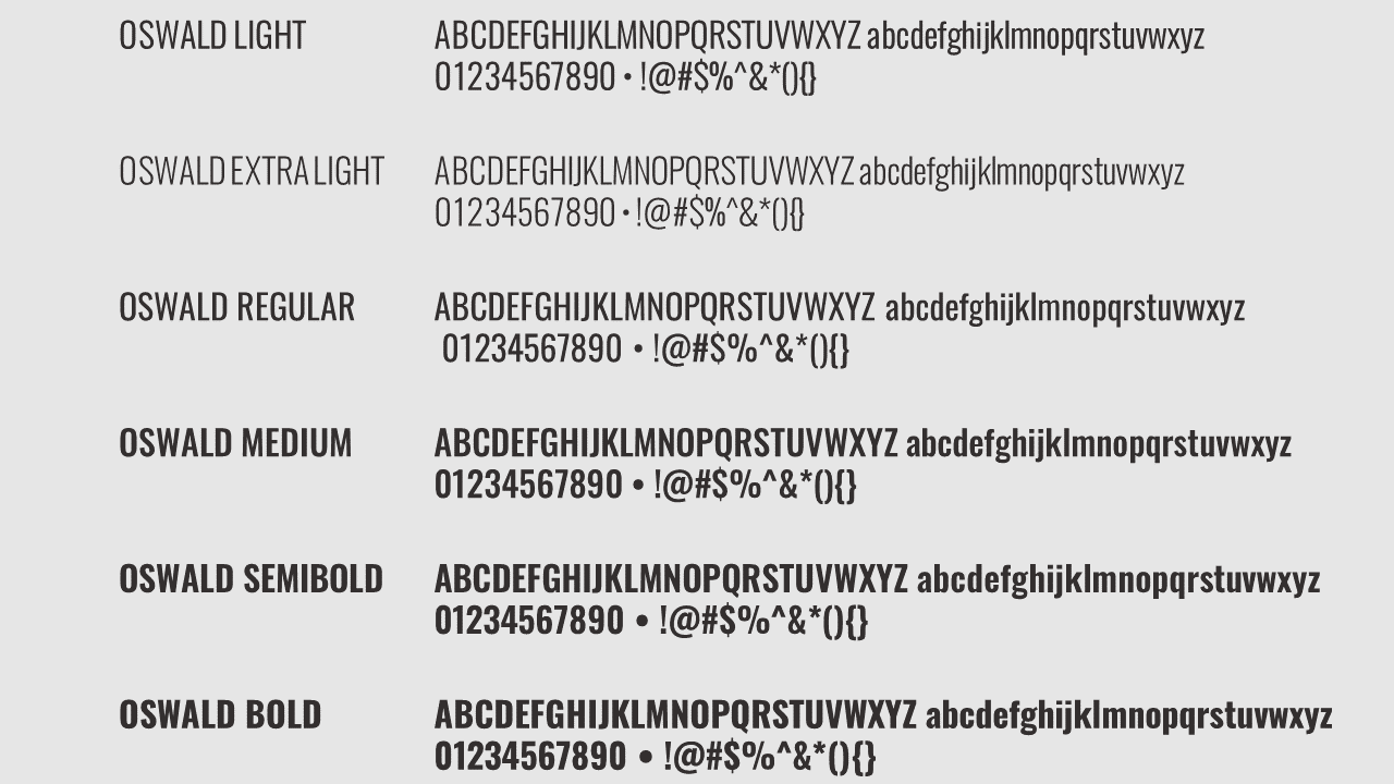
OSWALD is a free, open-source sans-serif typeface available through Google Fonts. It was designed by Vernon Adams and is based off the classic gothic and grotesque styles of the late nineteenth and early twentieth centuries. OSWALD is available in light, extra light, regular, medium, semi bold and bold weights. The characters of OSWALD have been re-drawn and reformed to better fit the pixel grid of standard digital screens.
SUPERA official typeface library consists of OSWALD family. This font is versatile, legible at smaller sizes and suitable for both screen and print. OSWALD Bold and OSWALD regular are used the most, for display and body copy. No other fonts should be used on SUPERA design or marketing collateral, unless otherwise specified in this section of the brand guidelines.
ALMARAI FAMILY
ALMARAI is a modern Arabic typeface family in 4 weights. The font was created by Boutros™ for optimal readability and suitability for both online and offline applications. ALMARAI'S beauty lies in its clarity and simplicity. Beneath the font's geometric look lies a strict adherence to calligraphic structure and rules.
SUPERA official Arabic typeface library consists of ALMARAI family.
ALMARAI Bold and ALMARAI regular are used the most, for display and body copy. No other fonts should be used on SUPERA Arabic design or marketing collateral, unless otherwise specified in this section of the brand guidelines.
FONTS COLOR PALETTE
HEX: #000000
RGB: 51/47/47
CMYK: 67% 66% 63% 64%
PANTONE: 440 C
SOLID COATED
HEX: #332F2F
RGB: 51/47/47
CMYK: 67% 66% 63% 64%
PANTONE: 440 C
SOLID COATED
HEX: #E6E6E6
RGB: 230/230/230
CMYK: 9% 6% 7% 0%
PANTONE: 663 C
SOLID COATED
HEX: #B1A382
RGB: 177/163/130
CMYK: 32% 31% 53% 1%
PANTONE: 452 C
SOLID COATED
LAYOUTS
SUPERA COFFEE & BAKERY is always written with uppercase. You can write Coffee & Bakery where you begins the word with uppercase if used in documents and emails. Otherwise will be all in uppercase as in the logo.
It is prohibited to write "and" instead of "&".
In order to protect our business identity and strengthen our market recognition, it is prohibited to use the name of our brand in lower case under any circumstances.

Primary headings should always be upper case.
Secondary headings and tertiary headings use lowercase apart from the opening letter of a sentence.
Always use SUPERA family fonts.
Ensure there is sufficient space around the headings.
Predominantly left aligned or right aligned depends on the language.
Avoid center aligned the body text

Body text should always be lowercase apart from the opening letter of a sentence.
The font has to be picked from our family fonts.
The minimum font size for body text is 12 point to ensure legible text.
Predominantly left aligned or right aligned depends on the language.
Avoid center aligned the body text

Circular bullets are the standard format.
you can use square bullets in special cases.
bullets are colored same as font color.
