PRIMARY
LOGO
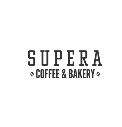
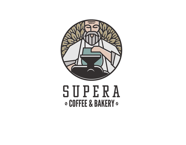
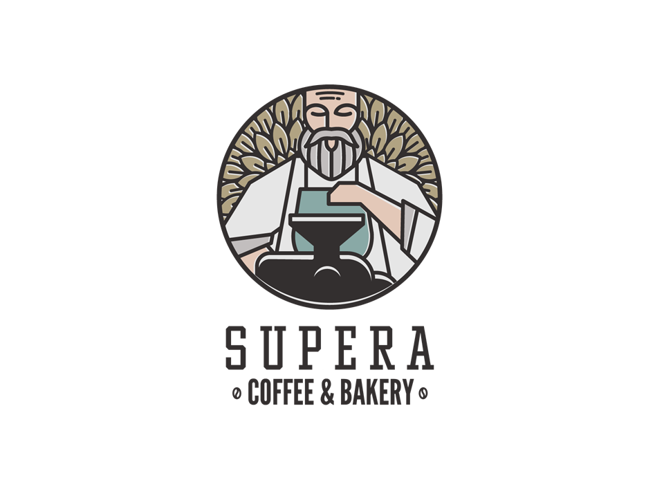
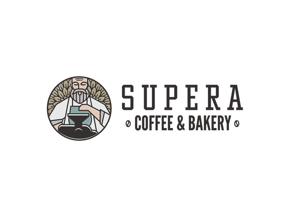
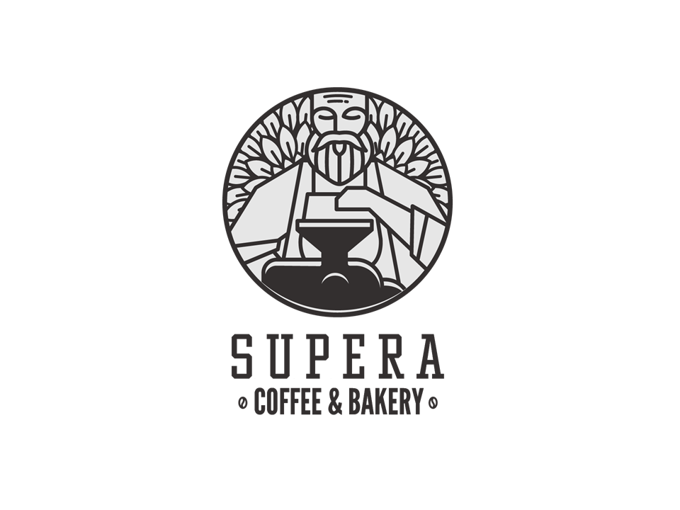
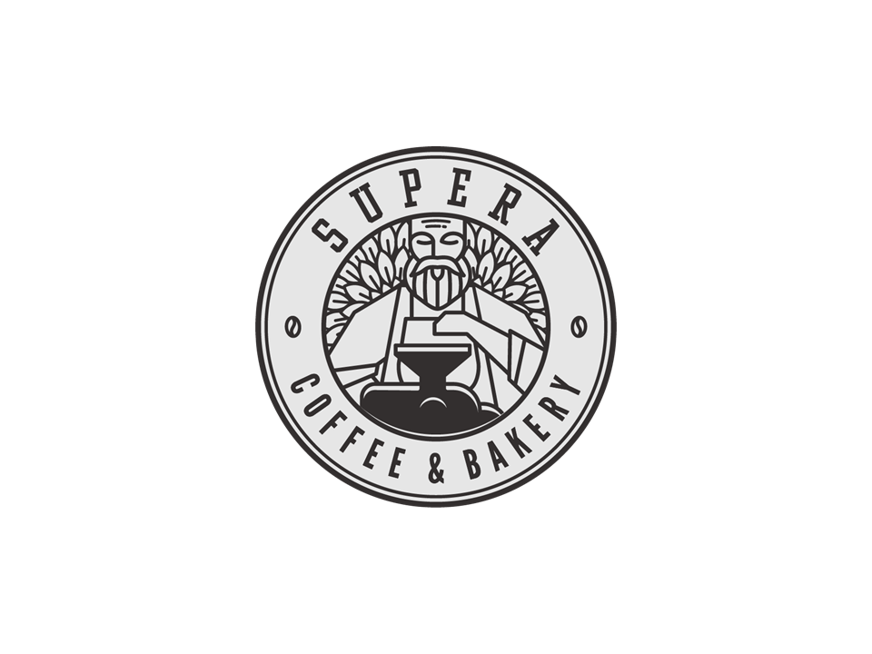
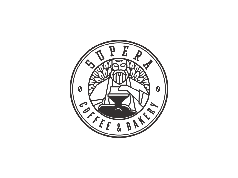
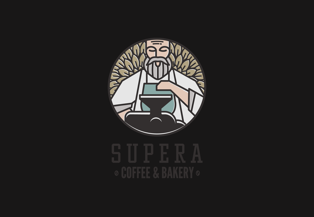
Full color vertical logo
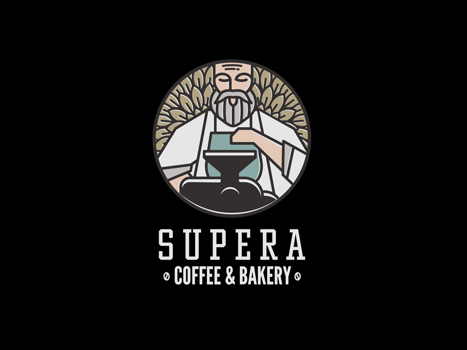
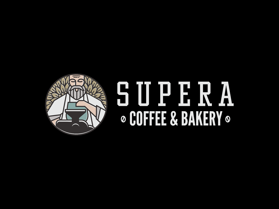
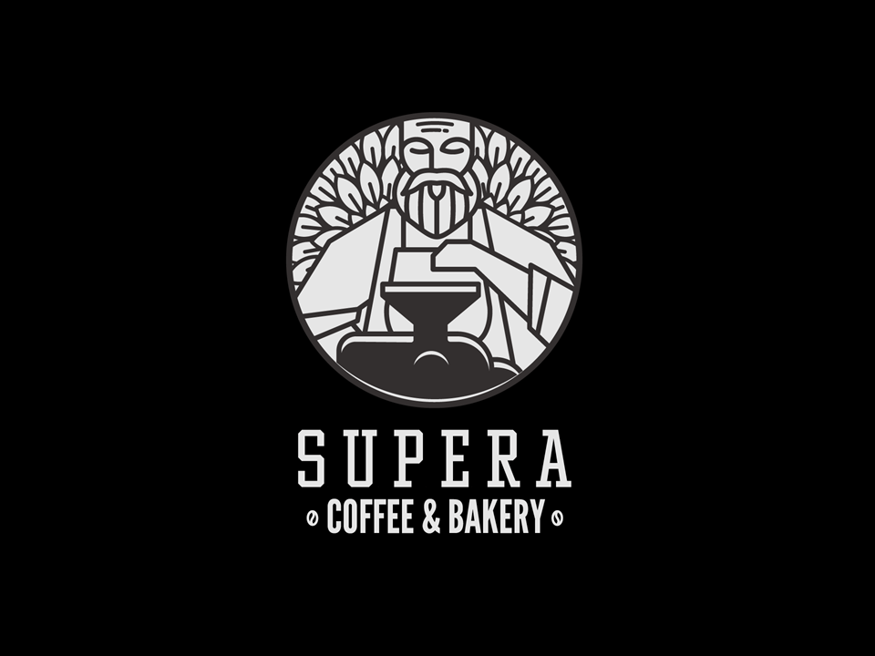
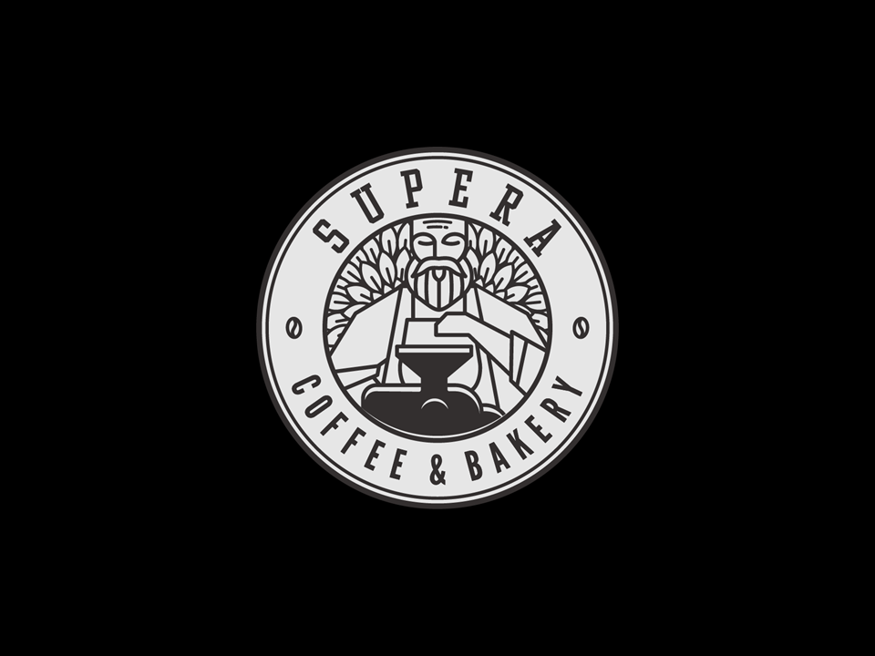
The primary vertical logo with full color is the preferred option. Where there is a background with insufficient contrast, the official reverse logos can be used.
The full logo is composed of the representative icon and text, The icon represents Miguel our legendary character holding his first grinder and in the back is the farm coffee leaves where everything started. Our brand character is built on combining the past and the future, legend and reality where Miguel is standing between the coffee beans where he began his journey and the grinder represent the future and the start of his dream and OURS.
Our logo includes a series of graphic elements used at various times to create a comprehensive, cohesive and recognizable identity that represents SUPERA Coffee & Bakery publicly.
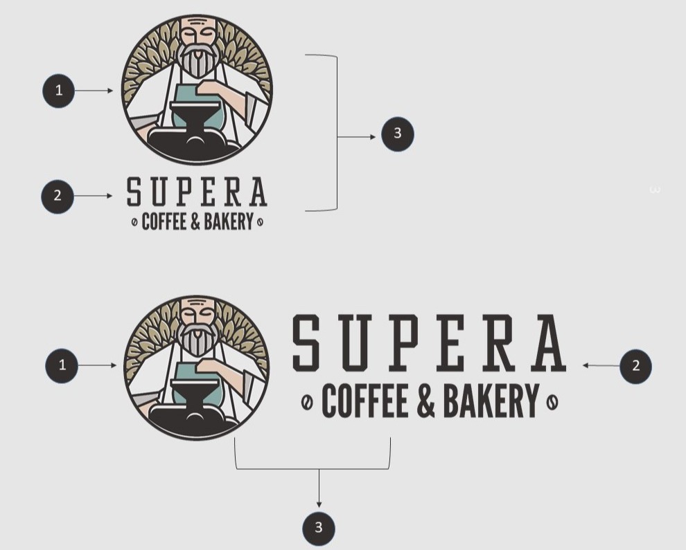
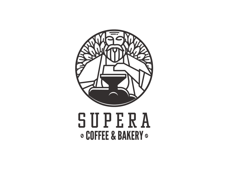
1. PRIMARY ICON
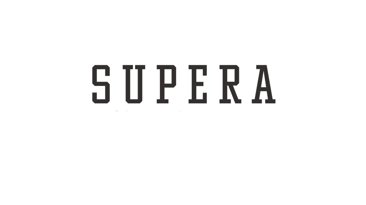
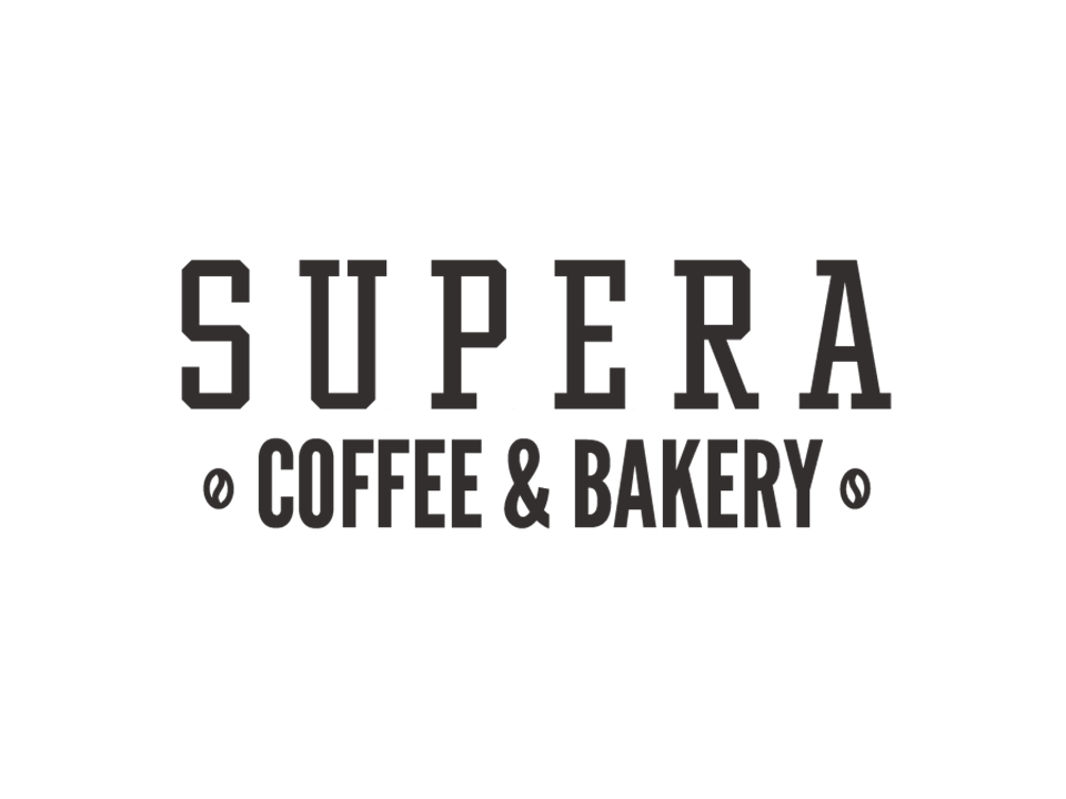
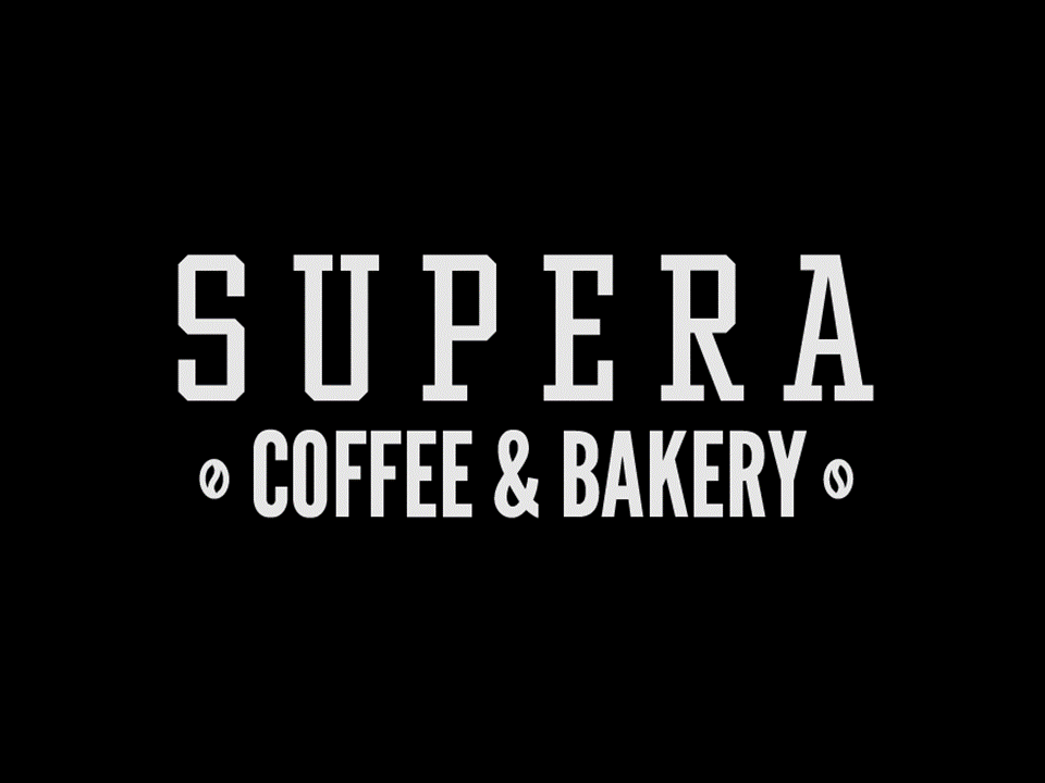
2. WORDMARK
3. LOCKUP
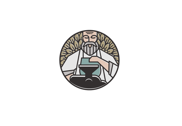
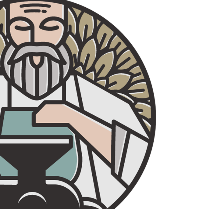
SUPERA character is the heart and soul of our identity. This icon must be uniform throughout all of our applications. The graphic integrity of Miguel character and identity elements should be governed by the consistent use of established standards and observed in all communications with our vendors, affiliates, and the general public.
The wordmark is the text-based part of the logo. It is made from carefully selected typeface "Winner Cond Regular 157pt, & League Gothic 100.74pt" with additional customization made to create a sense of unity when viewed in partnership with the icon.
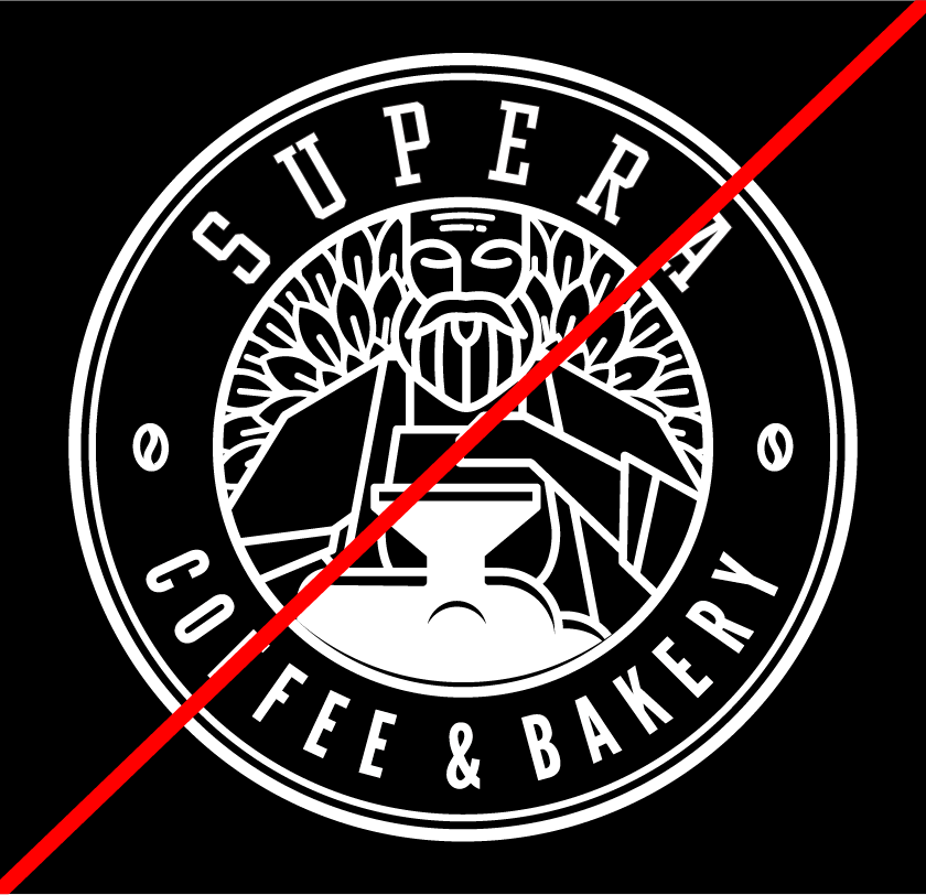
This is the final logo combination between the icon and wordmark. There are around six versions: vertical, horizontal and round – large scale & small. the logo lockups must retain these exact proportions and spatial relationships for all usages. Alterations to the logo lockups are prohibited.
LOGO VERSIONS
Full color vertical logo
The primary vertical logo with full color is the preferred option. Where there is a background with insufficient contrast, the official reverse logos can be used.
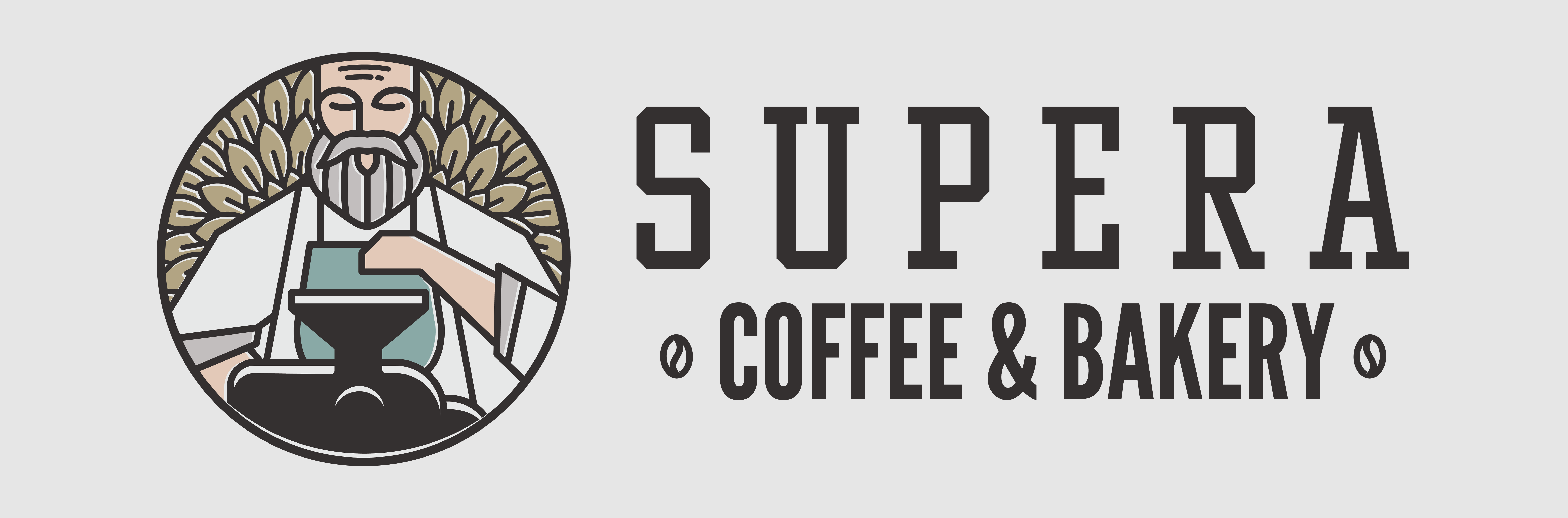
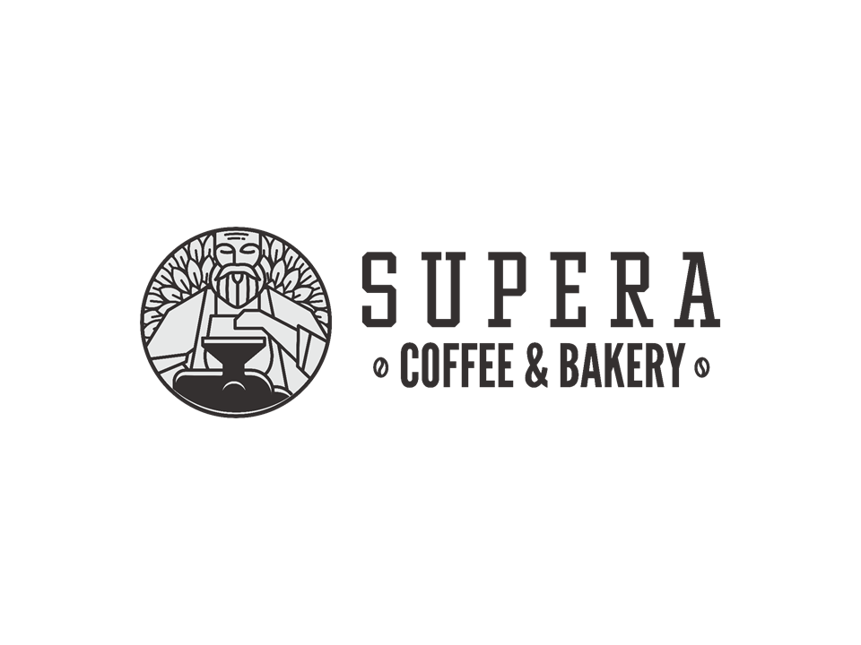
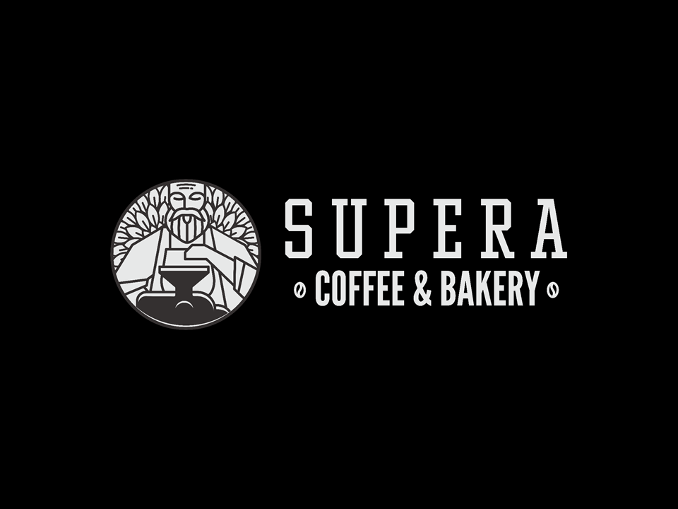
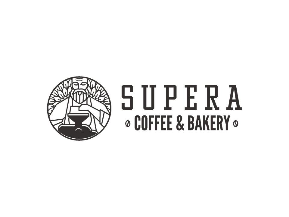
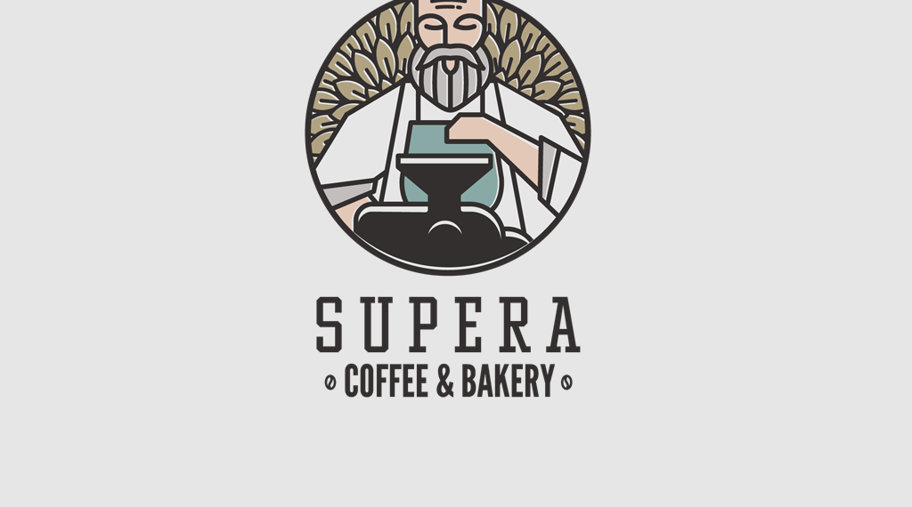
Full color horizontal logo
A secondary horizontal full color logo is available. This can be used in headers or footers in documents or on websites, or designs that work with this logo lockup.
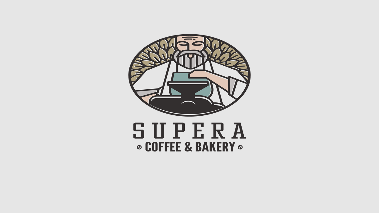
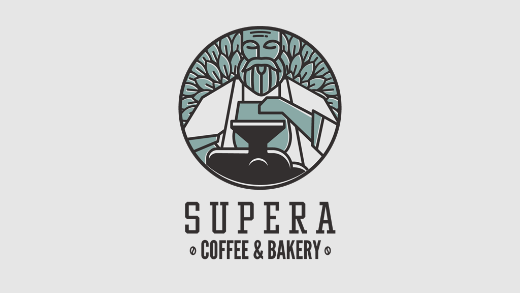
Full color secondary logo
A secondary circular logo is specially designed for narrow, small spaces & rounded, curved shapes.
SLOGAN
When the tagline appears with the primary logo, the two elements together are called the logo and tagline lock-up. This means that they are locked into a specific relationship to one another and form a single unit. The elements may not be rearranged or the relationship altered in any way to change the logo’s graphic integrity.
This tagline is only intended for use by SUPERA community. It may not be used without exclusive permission from SUPERA COFFEE & BAKERY. The tagline should never be altered. Only the official tagline should be used in communications.
For questions on usage, contact us.
CLEAR SPACE
Always allow proper breathing room around the logo. He’s an introvert at heart, he needs space. The logo needs sufficient space around it so that it is not confused with other words or wordmarks.
It needs to be legible and work as a standalone graphic. Always leave at least 20% of empty space around the logo.
LOGO COLORS
ART WORK